Old National Bank Petitions Lawmakers to Update Handicap Sign
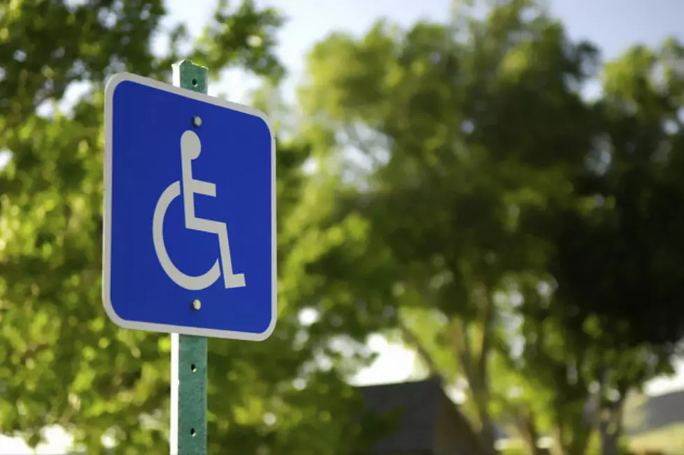
The image denoting handicap access for restrooms and parking spaces is one of the most recognizable logos in the world, but after 50 years, Old National Bank in partnership with Abilities First Associate Resource Group thinks it's time for the logo to change.
According to a press release, the Evansville-based bank submitted a petition to Indiana lawmakers last October (Disability Employment Awareness Month) asking them to consider updating to the logo below to reflect changing dynamics of those with disabilities.
The original logo was created in 1968, and according to Ben Trockman, Employment & Outreach Specialist and member of Old National’s Abilities First Associate Resource Group, the time has come for "a new and refreshed logo that better represents those with disabilities who make up the largest minority in the world.”
Truth be told, the logo has become such a routine part of our ever day lives, those of us, myself included, who don't require the assistance of a wheel chair or other mobility accessory to get around, only see it as a sign that tells us we can't park in certain spots. With the advancements in assisted mobility, and the perception of those who rely on them changing over time, I can certainly understand how those who this sign is intended for feel as though this is not an accurate representation of their ability.
You've probably put zero thought into how the original depicts those with disabilities. I know it's never crossed my mind. But look at the comparison above again. Compared to the new, suggested logo, the original does give off an invalid-type vibe. It looks like what TV shows and movies have depicted as a patient from a 1950's hospital. You know the one, the patient sitting in a wheelchair, wearing hospital-issued pants and a shirt with a blanket draped over their legs being pushed down the hall by a nurse wearing a triangle-shaped hat.
Thanks to people like Ben Trockman and others, the perception of those with disabilities continues to evolve from one that is part of who they are as a person, not one that defines them.
Whether or not the update will happen is to be determined, although the Indiana House of Representatives did adopt a resolution in March of this year "in favor of studying implementation of the new signage by a vote of 88-0," according to the press release which sounds like a step in the right direction.
What do you think? Is it time for handicap accessible logo to get an update that's more reflective of the people it represents? Let's us know in the comments below.
[Source: Old National Bank]
More From WDKS-FM